
In this project, I worked on redesigning the system's homepage and creating a dashboard focused on real-time operational data, supporting managers and administrators in making faster, more informed decisions. The challenge was to transform complex data into a clear and actionable experience.
The Problem
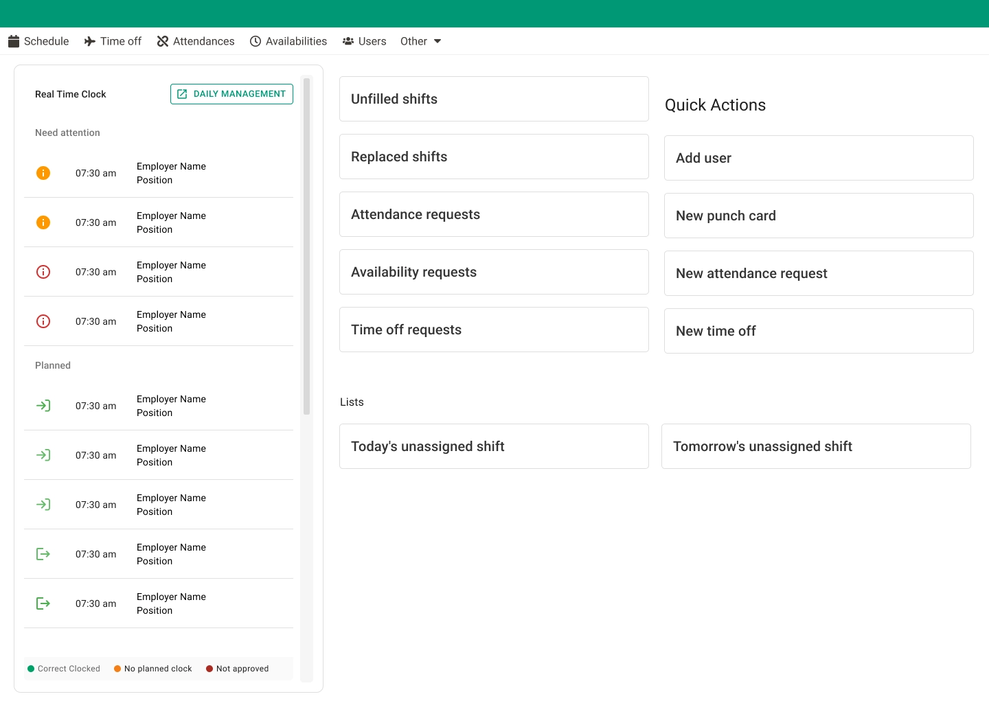
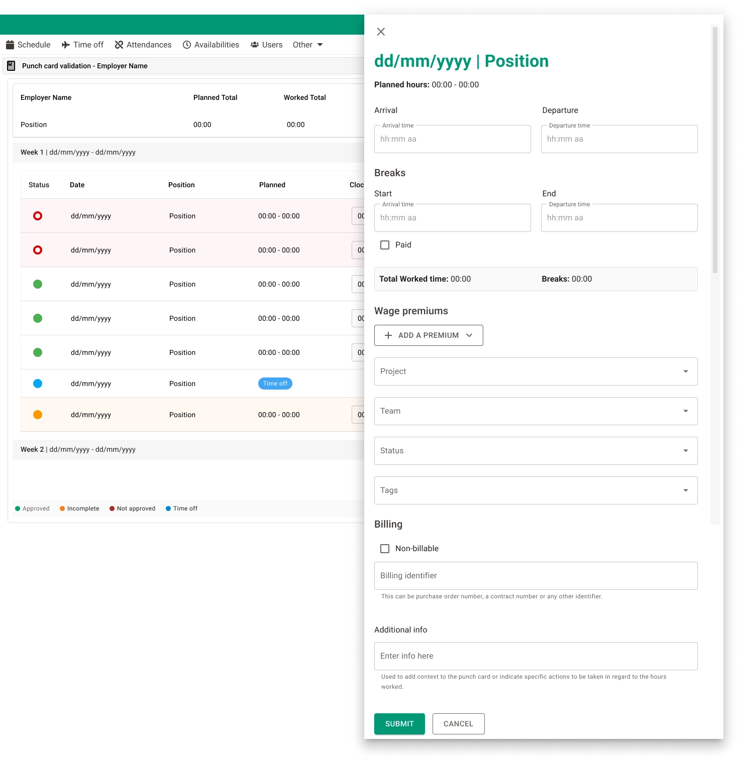
Managers needed quick access to real-time punch in/out information, but the existing homepage did not provide clear visibility or prioritization of critical data. The lack of structure made it harder to monitor employee activity efficiently.
Goals
- →Improve visibility of real-time data
- →Create a clear and scannable dashboard layout
- →Support faster decision-making
- →Align data presentation with user priorities
My Role
- →UX/UI design of the homepage and dashboard
- →Structuring information hierarchy
- →Designing data visualization patterns
- →Aligning UI decisions with operational needs
Process
- 1. Analyzing existing homepage and identifying gaps in data visibility
- 2. Mapping manager workflows and decision-making needs
- 3. Defining data hierarchy and widget architecture
- 4. Iterating on layout density and information structure
- 5. Validating clarity and scannability with the team
Key Solutions
Home & Dashboard Redesign
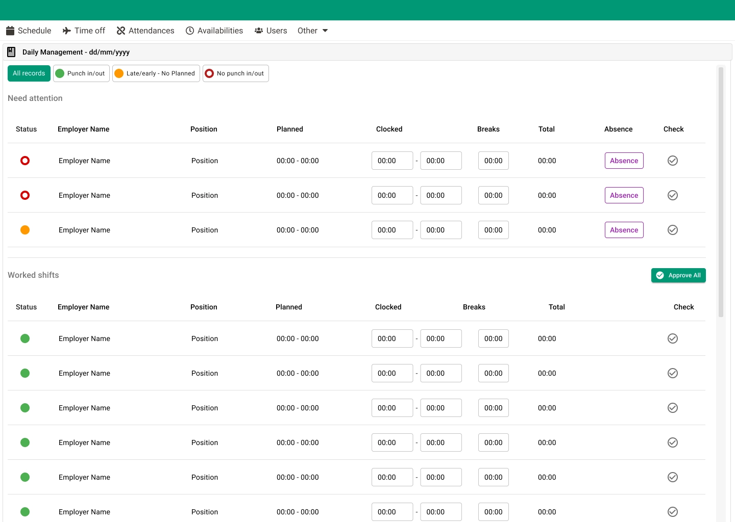
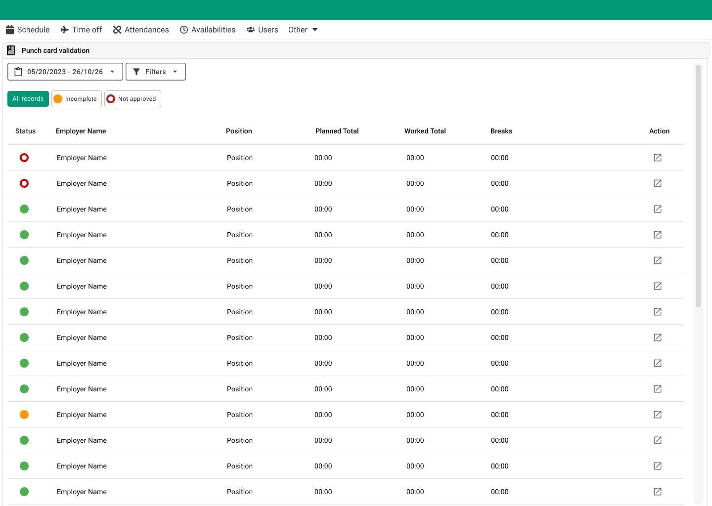
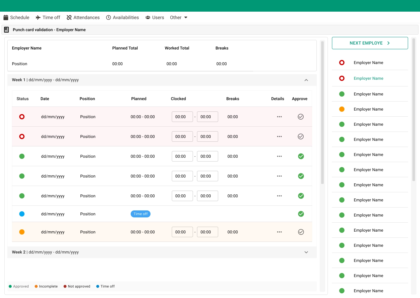
I redesigned the homepage to function as a dashboard, displaying real-time punch in/out data in a clear and structured way. The new layout helped managers quickly understand employee status, identify issues, and take action when necessary.
Impact & Outcome
- ✦Faster access to critical operational data
- ✦Improved clarity of employee activity
- ✦Reduced effort to monitor punch records
- ✦More efficient daily workflows for managers
Learnings
Designing for operational users requires prioritizing clarity, speed, and hierarchy over visual complexity. Small UI decisions can significantly impact efficiency at scale.