Merinio is a SaaS platform that helps companies manage employee scheduling, time tracking, and communication. In this project, I focused on improving the employee-facing experience, redesigning key areas of the Employee Portal to make daily tasks clearer, faster, and more intuitive. My work concentrated on simplifying complex workflows while modernizing the interface to support scalability and long-term product growth.
The Problem
As the product evolved, the Employee Portal accumulated features that were essential but increasingly difficult to navigate. Employees struggled to quickly understand their schedules, approve shifts, and communicate efficiently with managers. This complexity impacted usability, clarity, and overall adoption of the platform.
Goals
- →Improve clarity and usability of employee workflows
- →Reduce friction in scheduling and shift approval
- →Modernize the interface while respecting existing system constraints
- →Create a more intuitive and consistent experience across features
My Role
- →UX/UI redesign of employee-facing flows
- →Layout modernization and visual hierarchy
- →Improving information architecture and interactions
- →Collaborating with developers to ensure feasible solutions
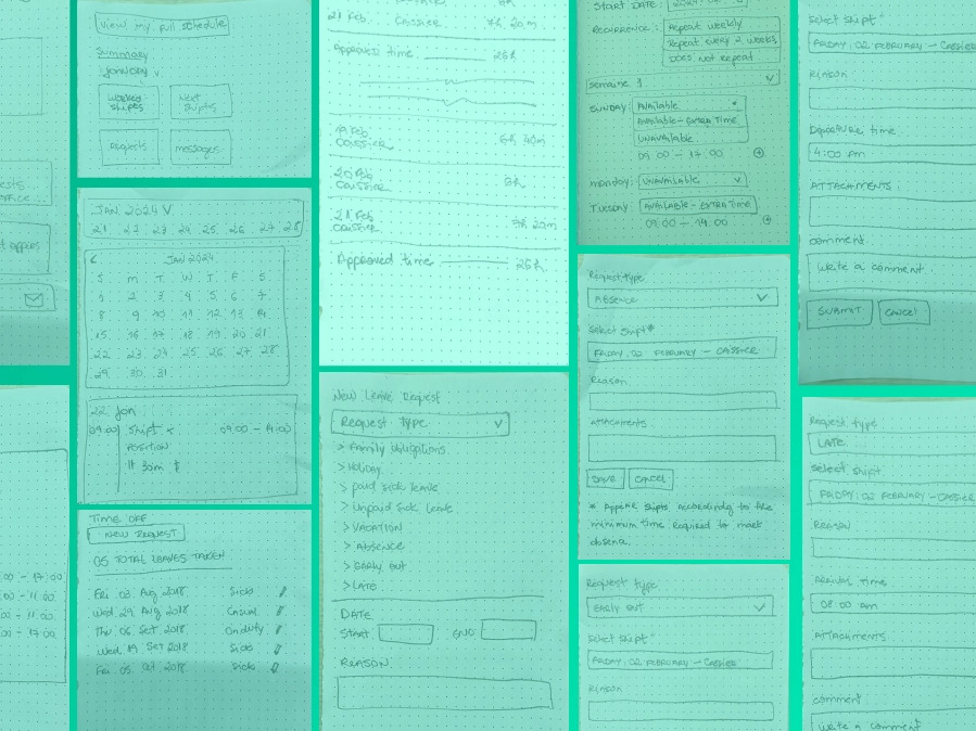
Process
- 1. Analyzing existing flows
- 2. Identifying friction points
- 3. Redesigning layouts and interactions
- 4. Iterating with feedback from the team
- 5. Aligning UI decisions with business and technical constraints
Key Solutions
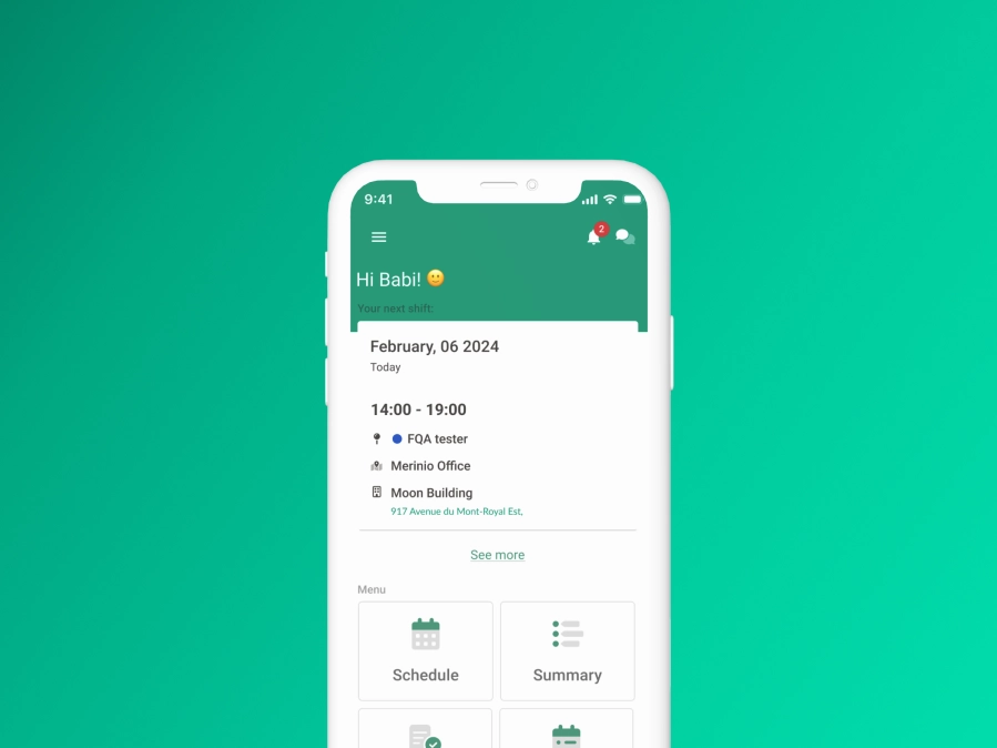
Employee Portal Redesign
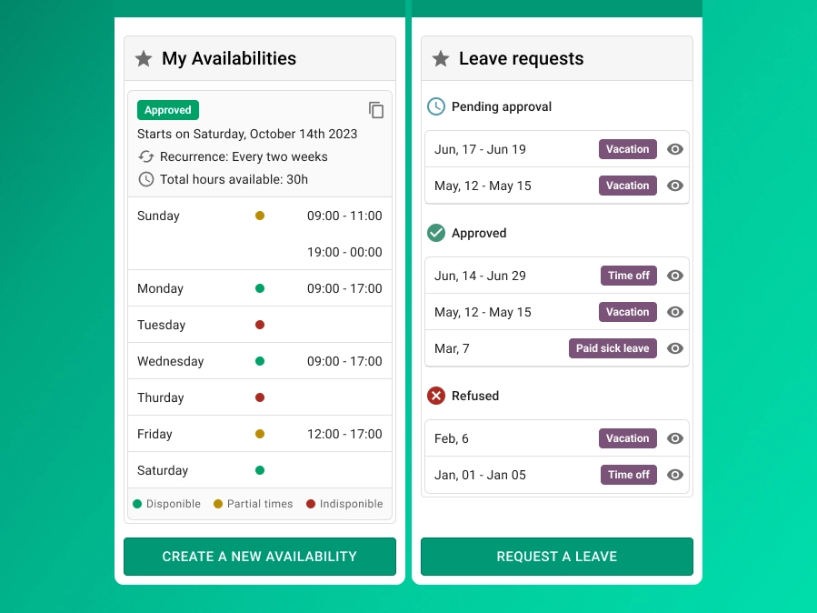
I redesigned the Employee Portal interface, focusing on clarity and ease of use. The new layout improved navigation, visual hierarchy, and readability, helping employees quickly access schedules, availability, and actions without friction.
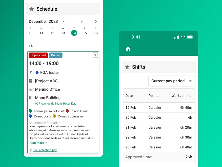
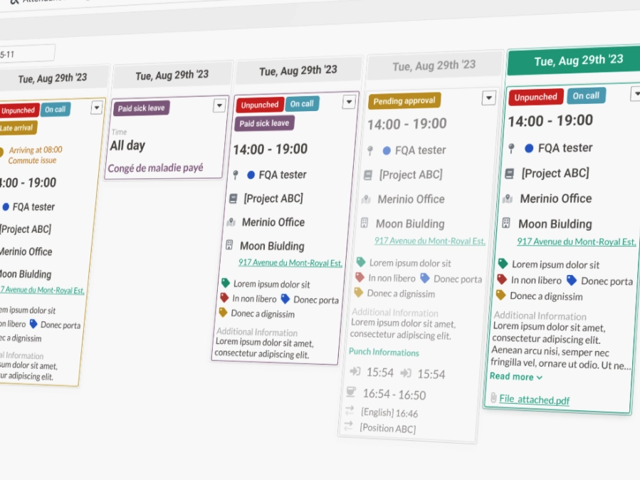
Schedule & Shift Management
I improved the shift management interface to make viewing, approving, and understanding shifts more intuitive. The redesigned flow reduced cognitive load and made critical actions easier to identify and complete.
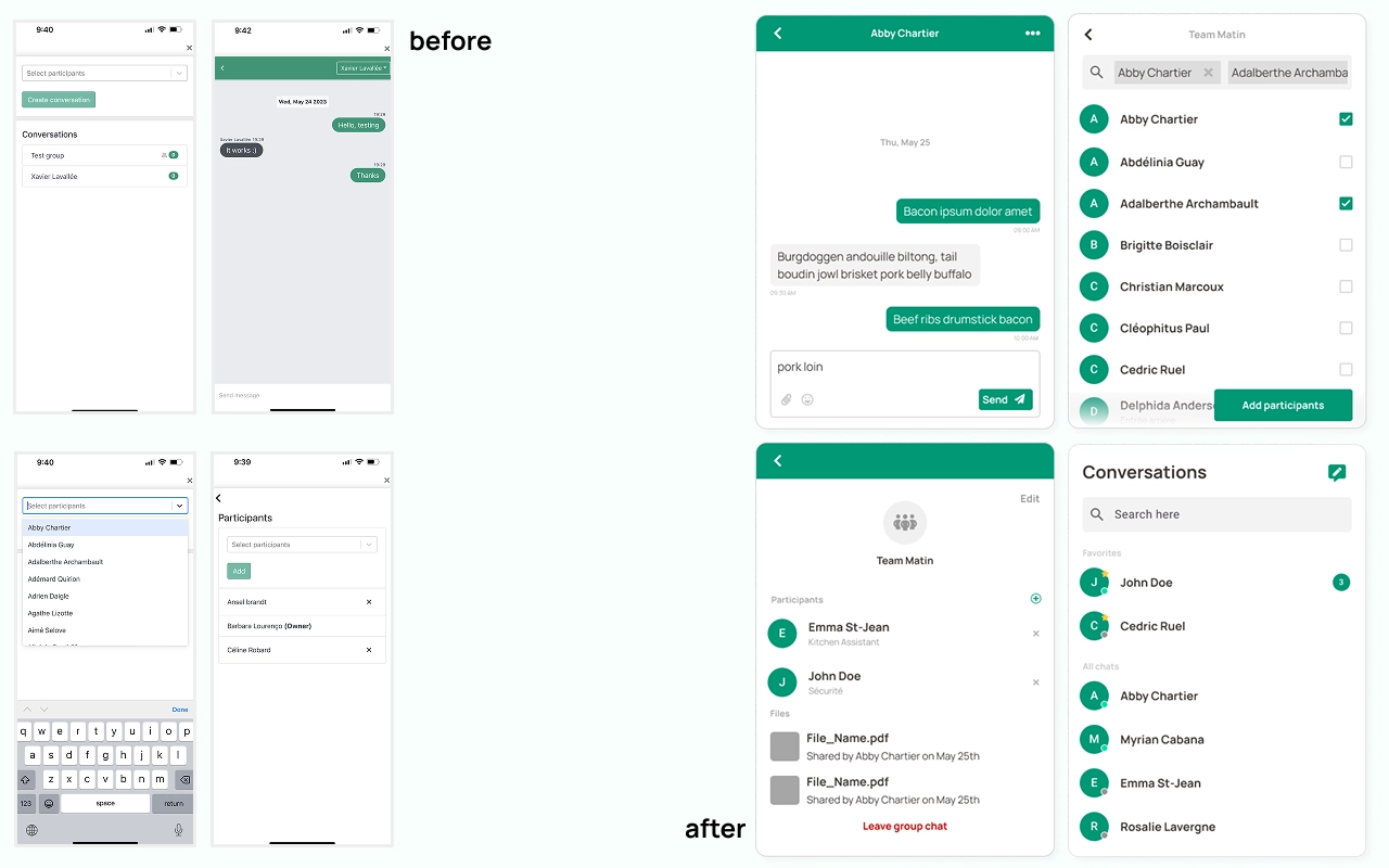
Internal Chat Experience
I restructured the internal chat system, redesigning conversations, contact details, groups, message flow, and attachments. The goal was to create a clearer communication experience between employees and managers, aligned with the rest of the product's UI.
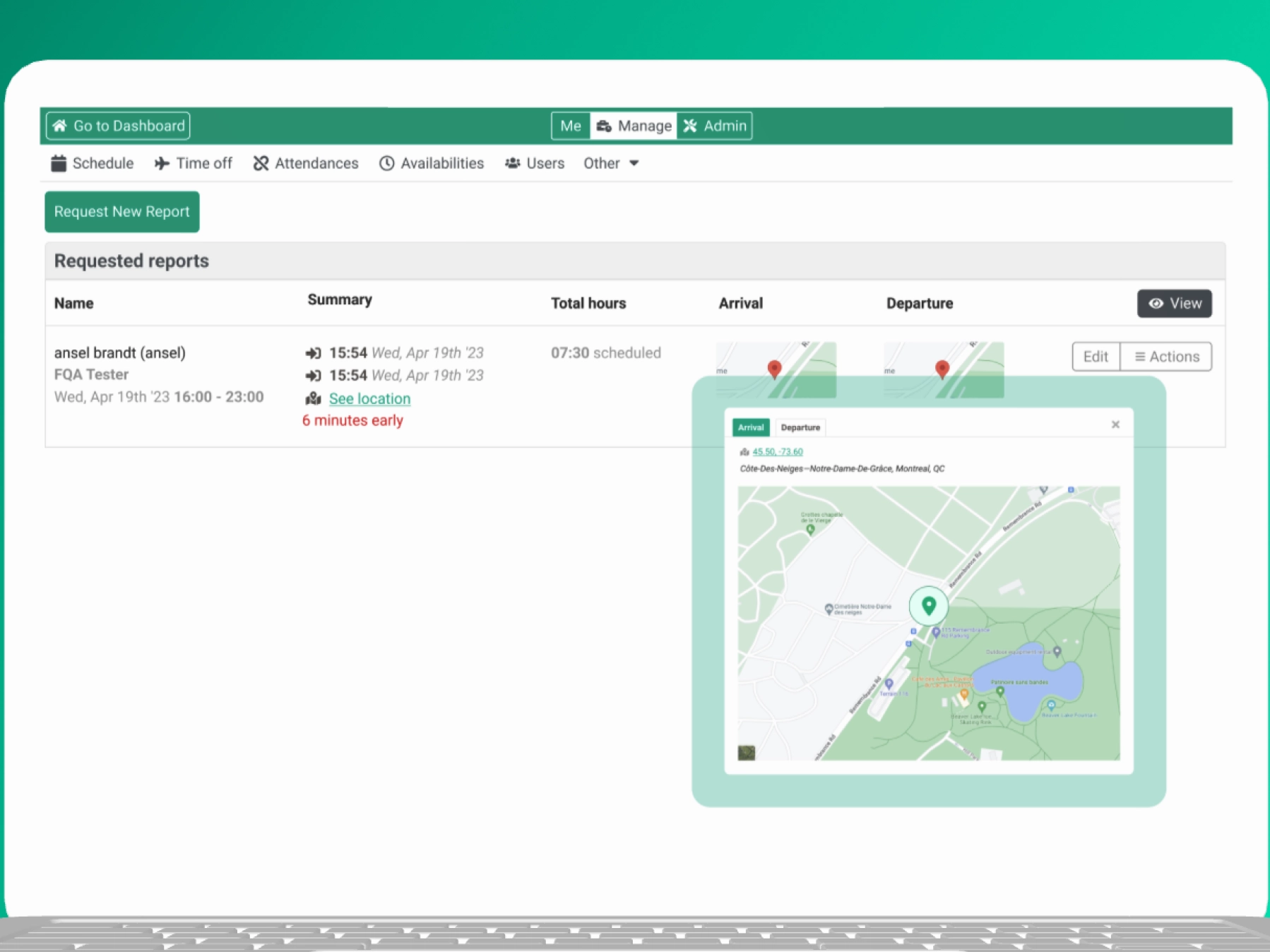
Geolocation for Punch Records
I introduced a map-based feature to employee punch records, allowing managers to verify where punch-in and punch-out actions were made. This increased transparency and trust, ensuring employees were registering hours from the correct location via the Employee Portal web app.
Impact & Outcome
- ✦Improved clarity of daily employee tasks
- ✦Reduced friction in shift approval and scheduling
- ✦More consistent and modern UI across employee features
- ✦Stronger alignment between user needs and business rules
Learnings
This project reinforced the importance of designing scalable systems, balancing usability with technical constraints, and improving complex workflows without overwhelming the user.