In my first UX Design study, I accepted the challenge of understanding how to take advantage of telemedicine opportunities to improve the health of Brazilians who need psychological or psychiatric help, creating a solution focused on care and monitoring without geographic barriers.
Project Goal
Create an online psychological care platform that connects psychologists with patients, facilitating care and follow-up, so that Brazilians can be assisted remotely.
Users & Personas
User Context
The Current Scenario
The approval of online psychological care took place in November 2019 by the CRP (Regional Psychology Council). By April 2020, a month after the Covid-19 pandemic began, Google searches for online therapy had increased by more than 88%. With social isolation, the safest alternative for patients who chose not to interrupt treatment is through online care — which can also be more convenient, economical, and less time consuming.
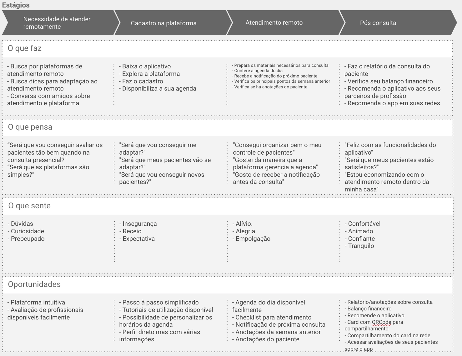
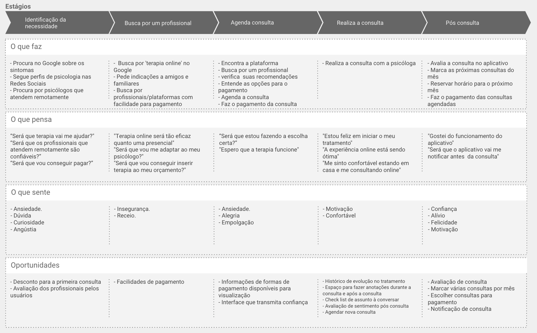
Journey Map — Patient & Psychologist
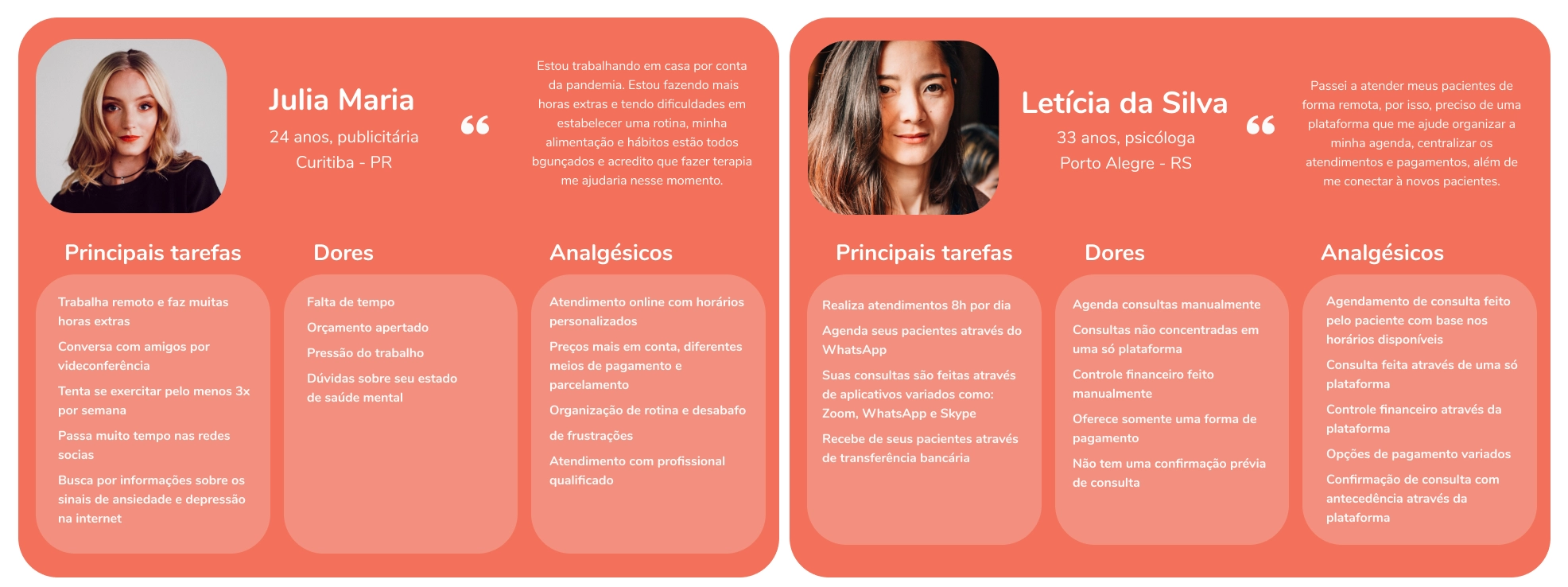
I created two proto-personas and their journeys — Julia Maria (patient) and Letícia (psychologist) — which through qualitative and quantitative research were validated and updated.
Research
Validating Suppositions
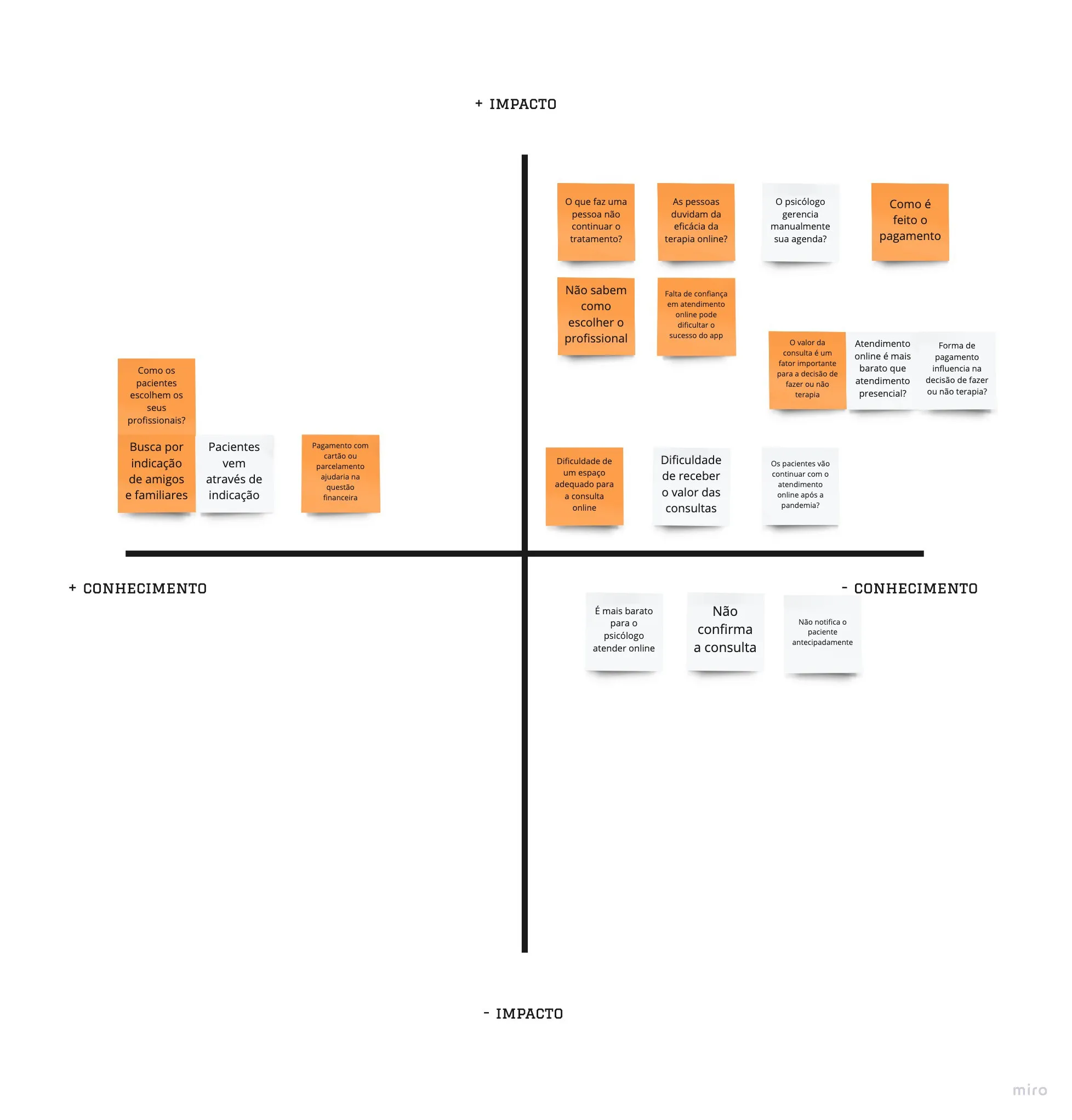
After defining the proto-personas and their user journeys, through the knowledge x impact prioritization method, I established a CSD Matrix with my main assumptions and doubts regarding potential users.
Quantitative Research
Of the 40 people who responded to the survey aimed at the general public, 62% do or have already undergone therapy and 37.5% said they never did. For people who have never had therapy, 46% answered that they think psychological care is too expensive. Regarding the service, 86.7% think they would be more comfortable with face-to-face service than online. From the 6 psychologists interviewed, all currently attend online — but only 50% did so before social isolation.
Qualitative Research
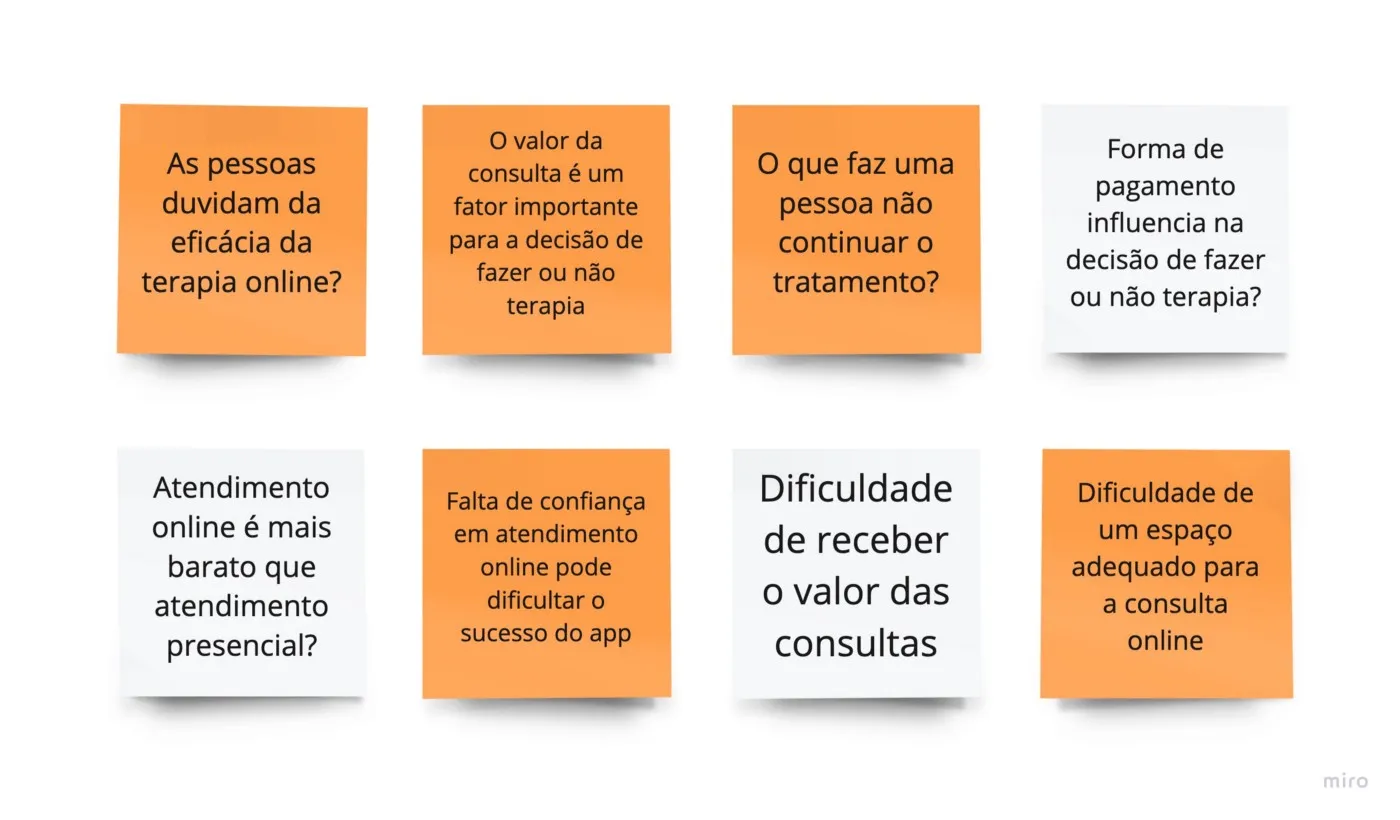
With the answers from the quantitative survey I conducted a qualitative survey with 7 people. Key findings: some patients felt more comfortable having their first consultation remotely; psychologists' biggest frustrations are with connection stability; patient compliance and punctuality remotely is surprisingly good; the secrecy of the remote consultation is a concern for psychologists; the most used means of dissemination is through referral.
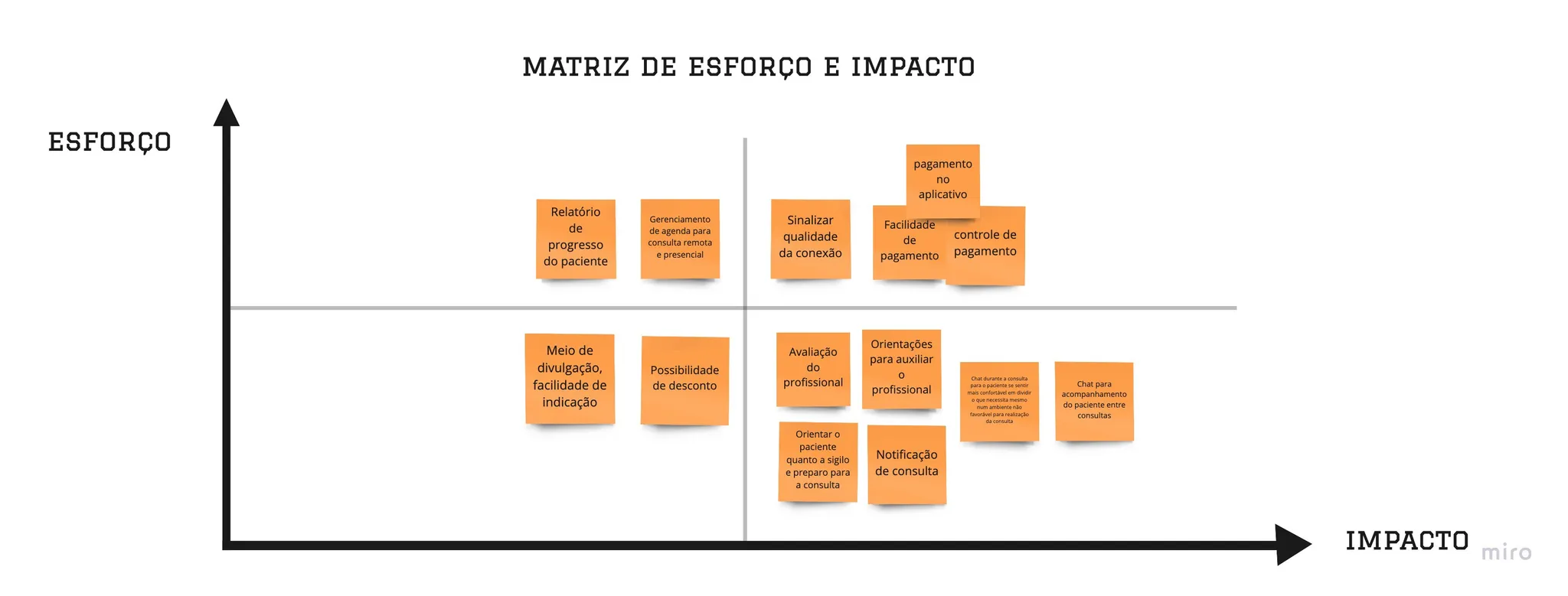
Solution Alternatives
Using the "How could we" technique, I listed the opportunities found: How could we guide the professional and facilitate the process of their online care? How could we convey confidence to patients so they feel comfortable with online therapy? How could we facilitate payment for appointments? How could we solve the problem of confidentiality of consultations between patients and psychologists? I chose to prioritize confidentiality — and the solution I offer is Cozy.
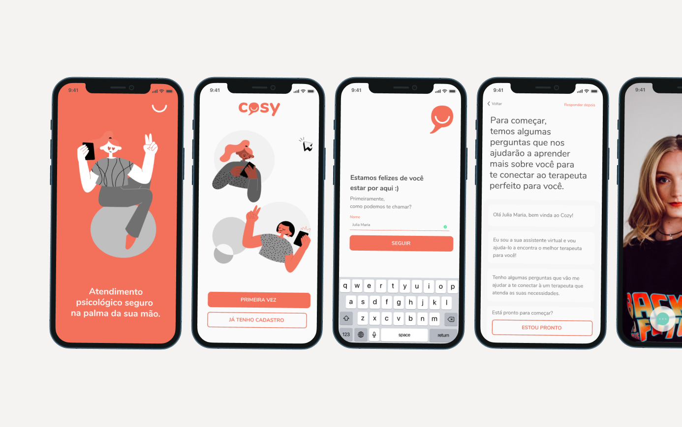
Solution
Cozy is an application where it will be possible to find an expert based on the answers to a questionnaire right when the user creates their account. During the consultation, made through video call, it will also be possible to send text messages — thinking of moments when the patient is not in a suitable place to carry out the consultation and is insecure to report a problem aloud.
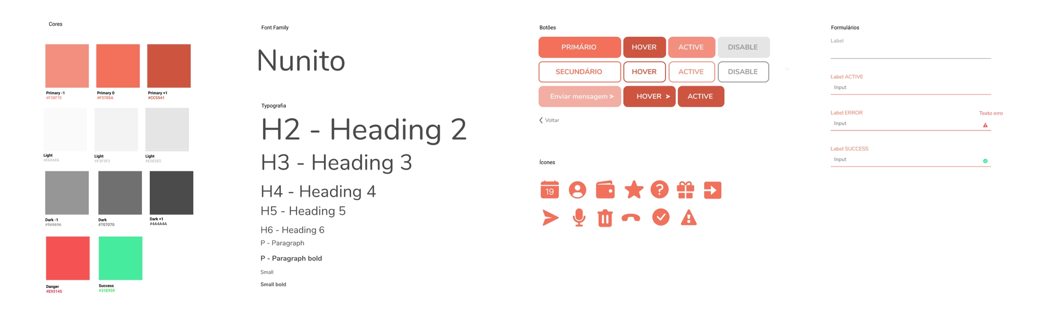
The name Cozy comes from English and means welcoming — that is the purpose of the application, to bring welcome to those who need psychological care. The construction of the logo is done with lowercase letters and the symbol with a conversation balloon with a smile. The orange color was chosen because it transmits joy, energy, and warmth. The chosen font was Nunito, a sans serif font-family with rounded edges that speaks to the chosen identity.
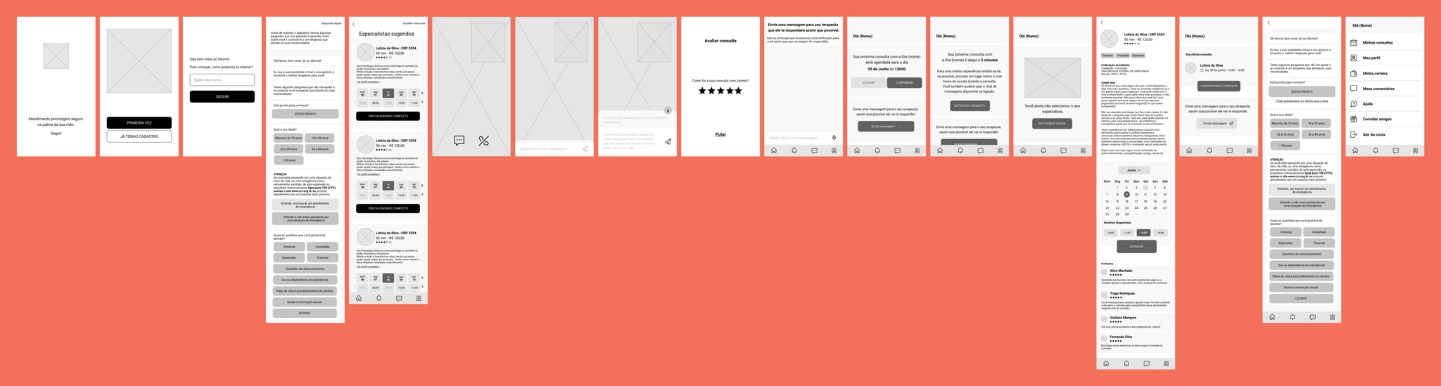
Wireframes
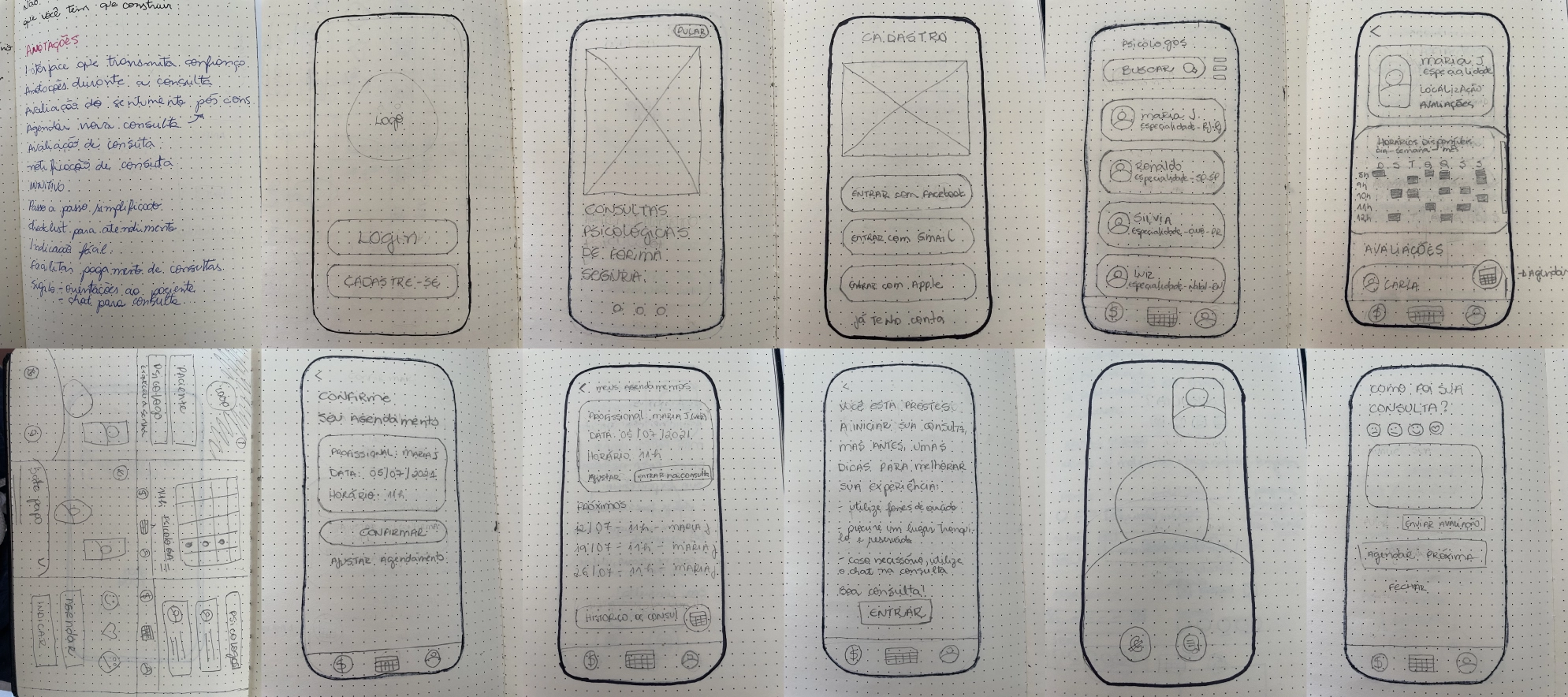
I created Cozy sketches using the Crazy 8's technique, then moved to a low-fidelity prototype. I applied the improvement solutions discovered with the scribble frame tests in the medium fidelity prototype (wireframe), defining and improving the flow.
Usability Tests
- →The form where the person selects their needs lacks a confirmation button
- →In the expert list, the times placed in the slide form are confusing for the user
- →On the expert page, users expected to see the date calendar before the expert description section
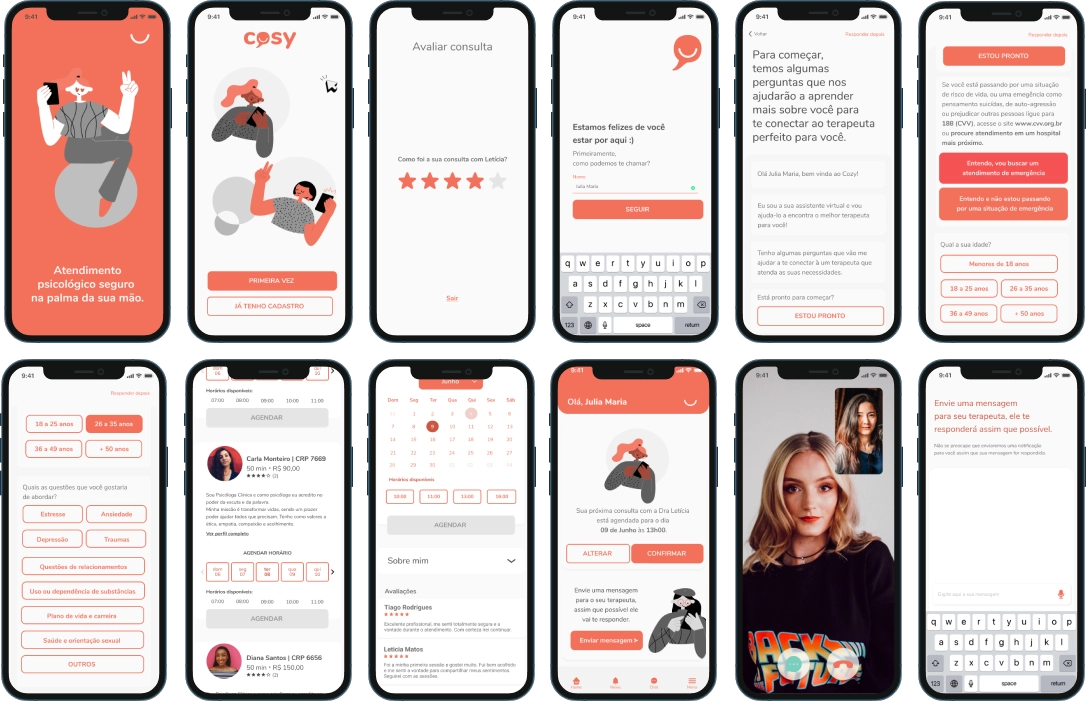
Prototype
Applying the improvement solutions identified in the wireframe usability tests and styles, I arrived at the high-fidelity prototype. Cozy was the result of my first UX Design process — I learned to put the user at the center of my decisions and to think how the user would think when using a product.
Next Steps
The next step will be to implement payment methods and history for monitoring, both for the patient and the psychologist. I also see the need to expand Cozy to the desktop.